Tag Archive for: modern art

New Tech Meets Old Techniques

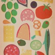
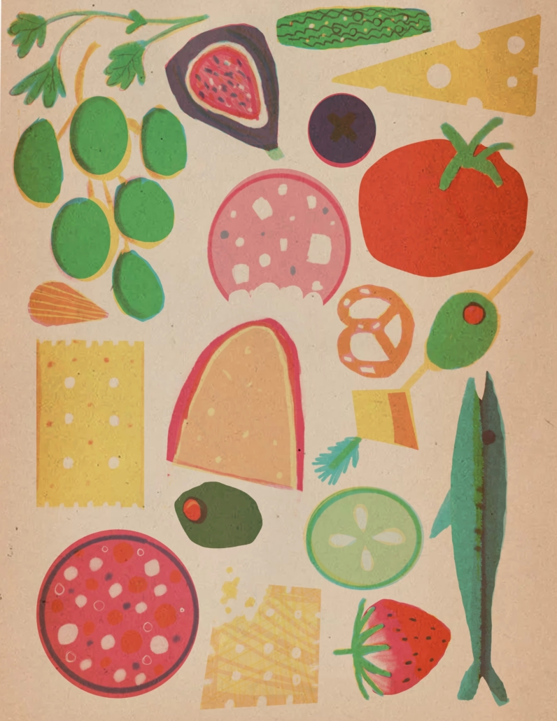
The renewed interest in midcentury design and vintage illustration isn’t just about nostalgia. It speaks to the lasting power of visual language and the way older styles can feel surprisingly fresh in today’s digital culture. One style that has captured a lot of attention is the risograph aesthetic. Once tied to the quirks of duplicator machines, it has now been reimagined by a new wave of artists who are using digital tools like Procreate to bring it into the present.

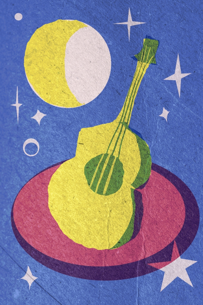
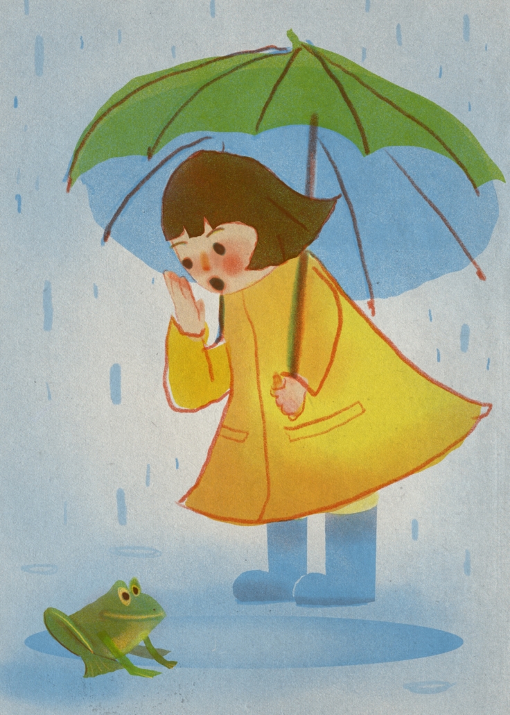
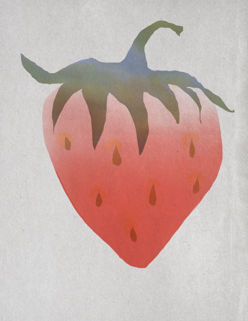
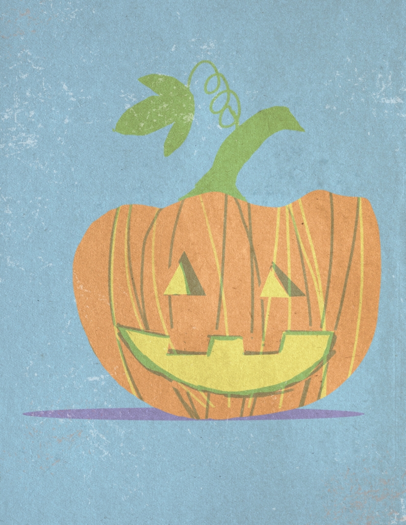
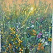
What makes this blend of old and new so appealing? A big part of it comes from the balance between restraint and vibrancy. The risograph look is known for bold overlays of limited color palettes, ink textures that feel imperfect in just the right way, and a handmade warmth that digital art often lacks. When those qualities meet the midcentury love of clean geometry, playful abstraction, and simplified forms, the results feel both modern and timeless.

To understand why this style continues to resonate, it helps to look back at the artists who shaped it in the first place. Mary Blair, who redefined color and form at Disney, showed how bold shapes and palettes could spark imagination. Charley Harper, famous for his “minimal realism,” distilled the natural world into flat planes and sharp edges while still keeping a sense of playfulness. Saul Bass, with his unforgettable film posters and title sequences, proved that simple graphic forms could tell complex stories. Their work created a visual language that remains influential to this day.

Today, illustrators working in Procreate can recreate many of these qualities with ease. Specialized brushes mimic the granular textures of ink, while color palettes recall the warm oranges, muted teals, and soft ochres that defined midcentury design. Even though the software was built for clean, pixel-perfect results, many artists use it to replicate the charming imperfections of hand-printed work.

Part of the appeal comes from what this style represents. In a digital world filled with polished, hyper-real visuals, risograph-inspired illustration offers something more human. Its limited palettes feel intentional and calming. Its imperfections feel authentic. And its connection to midcentury optimism gives it a sense of creative experimentation that still feels inspiring.

Blending these vintage influences with today’s technology allows artists to extend the conversation started by Blair, Harper, and Bass. The work might appear on Instagram, in a zine, or as a digital print rather than in a midcentury magazine or poster campaign, but the goal is the same. It’s about communicating ideas and emotions through form, color, and suggestion in ways that are both engaging and approachable.

For collectors, designers, and art lovers, this isn’t just retro charm. It shows how design languages adapt and evolve while holding on to their core ideas. Risograph style and midcentury-inspired illustration remind us that beauty can come from limitation, clarity can come from reduction, and even in the digital era, people are still drawn to the warmth of the handmade.

The Art of Suggestion: Communicating Visual Complexity Through Minimalism

How do we depict the world in a way that communicates its vast richness, nuance, and detail without overwhelming the viewer or sacrificing aesthetic appeal? This is a question I return to often in my studio practice as a visual artist, especially when working in acrylic and exploring American industrial and roadside landscapes.

As artists, we are constantly negotiating between clarity and chaos. Our visual world is intricate, full of layered textures, shifting light, and endless information. Yet in art, more isn’t always more. A canvas cluttered with detail can quickly become noisy, distracting, or even uninviting. So the question becomes: how can we express complexity while preserving beauty and balance?

Lately, I’ve been exploring this through the power of minimalism in painting. Not minimalism in the strict, traditional sense, but rather the idea of evoking more with less. I’m interested in how the human mind fills in the blanks, completing implied shapes and textures with its natural tendency toward gestalt perception; the psychological phenomenon that leads us to see patterns, wholes, and connections even when only fragments are present.

In practical terms, this means working with suggestion and illusion. It means allowing negative space to speak. It means painting a weathered building or a distant highway sign with a few confident marks instead of rendering every crack and rust stain in photographic detail. It’s about trusting the viewer and the medium to do some of the heavy lifting.

This process has opened new doors in my work. It challenges me to think not just about what I see, but what I want others to see. What is essential in a composition? What can be left out to make what remains even more powerful?

The result is work that feels both grounded and open, rooted in real landscapes and memory, but abstracted just enough to invite interpretation. I want to leave room for nostalgia, imagination, and the viewer’s personal experience to come into play.

Whether I’m painting rusted water towers, factory rooftops, or the glow of neon signs along a lonely stretch of road, I’m not just depicting objects. I’m invoking a feeling. A sense of place. A fleeting memory. And I’m learning that you don’t need to spell everything out for people to feel it deeply.

Walk through any large city and inevitably you will find a place so filled with shimmering lights and color as to make a medieval monk weep. We are of course, not generally so moved emotionally by the sight. If we could strip away all of the crass messages of capitalism and see with the pre-literate eyes of a child, perhaps we could see how the night shines. These colors sparkle like a stained glass cathedral, but they offer no messages of salvation, only salivation.

In the Studio:

This painting was challenging due to the depictions of neon lights, and all of the lights collecting together. Many times through the process I would add another glaze of color thinking it would be sufficient, only to find it still was not as bold as I wanted. There was a push and pull between adding enough darkness to let the light shine and having enough light to depict my vision. Careful use of many techniques including some sprayed paint come together for this symphony of color.

Behind the Painting:

This series of paintings was inspired by the feeling of driving home after a long day. Coming home from the day’s activities, tired, warm, letting the scenery pass you by as if in a dream. Conceptually, the road represents our journey in life. The hero must face the path ahead and rise to meet any challenge in his path, yet after all the experiences that he gains from his journey, he has not truly won the battle until he returns home.

In the Studio:

This series used some techniques that I had not previously been employing on my canvas art, but was familiar from my work with watercolor. I have several spray bottles of water that I use in varying ways. I have a tiny bottle, which can put out a fine mist, leaving the paint mostly undisturbed. I have a large spray bottle for larger amounts of water output, or for creating a droplet effect, and I have a bottle with added wetting agent. Additionally I use squeeze bottles, droppers, and more to apply diluted paint to the canvas. I work in many, many layers. I add paint, sometimes selectively and sometimes allowing it to simply do what it will. This allows me to achieve a great deal of interesting texture and a sense of flow. The pigments in the mixed paint colors do not always behave the same way, occasionally creating striations and swirls of color as they dry.

Once I am satisfied with the background of the painting I spend time simply observing it. I look at the way the colors have created a burgeoning composition. Sometimes I do a sketch onto tracing paper, or sometimes I simply begin. I carefully observe the colors and details of the images I use for references, taking elements from several usually to create my final piece.

Art and creativity are a practice, a habit. We can choose to keep innovating or we can stagnate. Sometimes to improve your craft, you need to learn how to let go of perfection and control. This series has been an exploration into a more organic and expressive vision.

Lately I have been returning to more watercolor techniques. When I was learning how to paint, I worked primarily in watercolor. I loved the gentle washes and the way pigments would granulate and pool. Acrylic doesn’t behave exactly the same way, it is much more robust and less prone to flights of fancy. It can require much more encouragement to make it behave the way I want it to. There are many times when I am surprised by the results of a layer once it dries. This is all in the magic of it. The practice of watching the paint drip and gently mix is meditative, but not passive. I am constantly adjusting and babying the layers of paint to make them work for me, moving the canvas, spraying more water, finding the perfect angle so the paint has the right amount of flow, there are many steps.

Life has taught me recently the importance of detachment. I can’t control everything, sometimes it feels like I can barely control anything in my life. All I can do is have faith, and let go.

Out in the Wet

There is a particular kind of stillness that inhabits a summer morning in the wetlands of Michigan. The air is thick with humidity, fragrant with loam and plant life, and alive with the quiet activity of native flora and fauna. In these moments, one might notice the orange blossoms of jewelweed nodding beside golden black-eyed Susans, while insects hover and birds call across the water’s edge.

These spaces are neither grand nor manicured. They are complex, subtle, and often overlooked. Yet for those who spend time observing them, wetlands reveal themselves as among the most ecologically rich environments in our region. They serve as natural filters for our waterways, buffering pollutants, slowing floodwaters, and sustaining an astonishing range of species: from amphibians to migrating birds to beneficial insects.

It is precisely because of their modest, functional beauty that wetlands are so vulnerable to neglect and degradation. The slow accumulation of pollutants—runoff from roads, lawn chemicals, improperly managed waste—often goes unnoticed until the damage is difficult to reverse. Unlike more dramatic environmental crises, the deterioration of wetlands happens quietly. It happens when we stop paying attention.

As an artist, I return to these landscapes not only for their visual inspiration but also for the sense of presence they demand. To paint wildflowers thriving along a mucky shoreline is to honor a form of resilience that does not ask for recognition. Yet these places are not infinite. They require a degree of stewardship that begins with awareness.

When we understand that clean water begins not at the tap, but in the quality of the soil and plants upstream, we begin to see wetlands not as wastelands, but as vital infrastructure. Their preservation is not a political position; it is a matter of public health, ecological literacy, and interdependence.

This painting, inspired by a humid morning walk through a native wetland, is both a tribute and a gesture of concern. It invites the viewer to look more closely—to witness the jewelweed and black-eyed Susans not just as symbols of summer, but as indicators of a living system worth protecting.

Whether through supporting local conservation groups, reducing our use of harmful chemicals, or simply becoming more curious about the wild corners of our landscape, we all have a role to play in maintaining the integrity of Michigan’s waterways.

What we notice, we begin to care for. And what we care for, we preserve.

Spring Break (2025) 16×20” acrylic on canvas

Part of the Roadside series


This series examines overlooked icons of Americana such as corner stores, gas stations, and motels, treating them as sites of cultural residue and quiet transformation. These spaces, often transient and peripheral, occupy a liminal position within the American landscape. They exist between points of departure and arrival, functioning as thresholds where movement pauses and time feels suspended.

I use vivid, saturated color to heighten the emotional charge embedded in these seemingly mundane locations. The brightness resists nostalgia and instead presents these structures as active elements within an evolving visual language. They appear not as static relics but as living symbols that reflect both continuity and change.

By isolating and recontextualizing these spaces, I explore the tension between familiarity and estrangement. Each painting becomes a reflection on memory, place, and the subtle architecture of everyday life. In celebrating what is often dismissed as ordinary, the work encourages a reconsideration of the American vernacular and reveals the aesthetic value embedded in its most unassuming forms.

Liquo Store (2025) 16×20”, acrylic on canvas

Part of the Roadside Series


This series examines overlooked icons of Americana such as corner stores, gas stations, and motels, treating them as sites of cultural residue and quiet transformation. These spaces, often transient and peripheral, occupy a liminal position within the American landscape. They exist between points of departure and arrival, functioning as thresholds where movement pauses and time feels suspended.

I use vivid, saturated color to heighten the emotional charge embedded in these seemingly mundane locations. The brightness resists nostalgia and instead presents these structures as active elements within an evolving visual language. They appear not as static relics but as living symbols that reflect both continuity and change.

By isolating and recontextualizing these spaces, I explore the tension between familiarity and estrangement. Each painting becomes a reflection on memory, place, and the subtle architecture of everyday life. In celebrating what is often dismissed as ordinary, the work encourages a reconsideration of the American vernacular and reveals the aesthetic value embedded in its most unassuming forms.

Acrylic on Canvas 10×10”

This vivid acrylic painting captures the monumental presence of Bethlehem Steel, reimagined through a palette of electric blues and acid greens. The layered industrial forms are softened by painterly washes and translucent veils of color, transforming steel and smoke into something luminous. This piece is part of my ongoing Rust Belt painting series, exploring industrial decline through the expressive potential of color. It’s a tribute to the grandeur and decay of American manufacturing history.