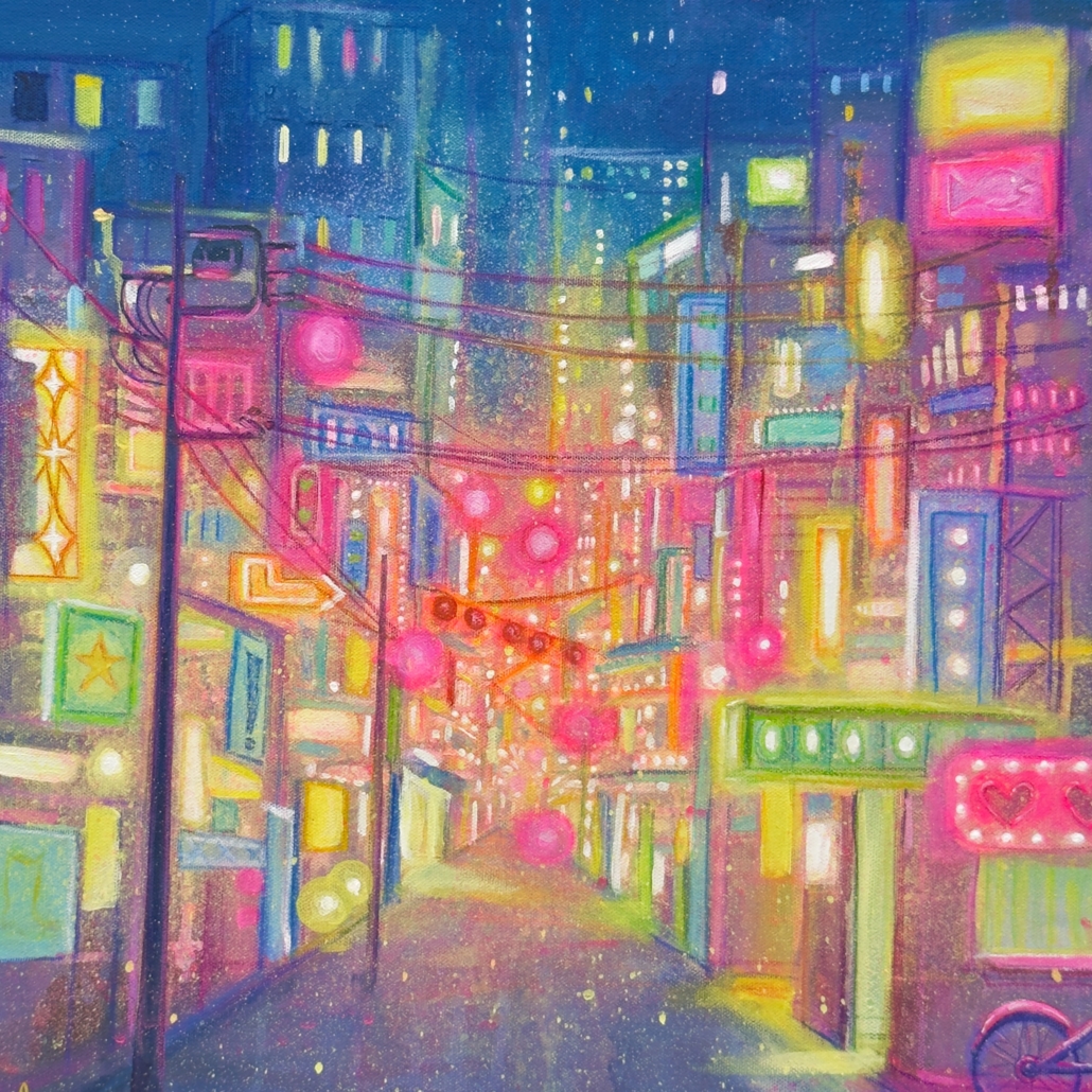
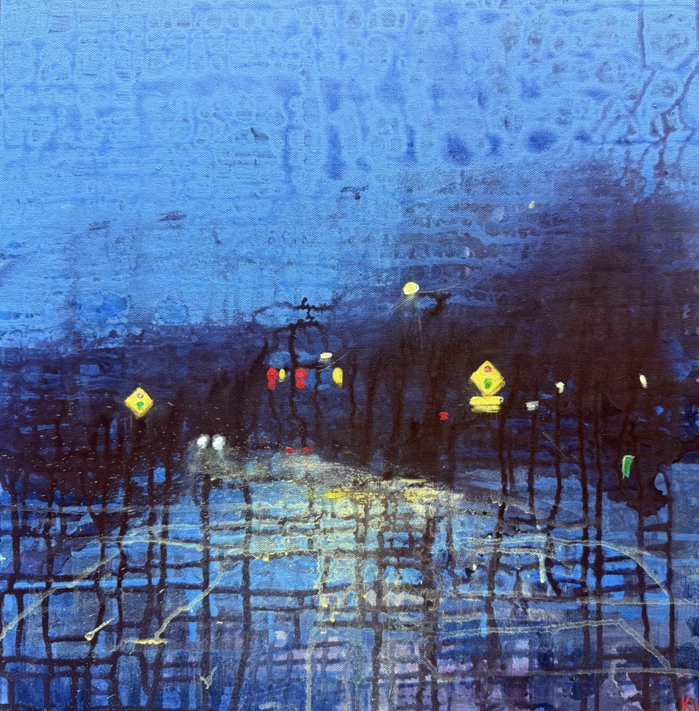
Walk through any large city and inevitably you will find a place so filled with shimmering lights and color as to make a medieval monk weep. We are of course, not generally so moved emotionally by the sight. If we could strip away all of the crass messages of capitalism and see with the pre-literate eyes of a child, perhaps we could see how the night shines. These colors sparkle like a stained glass cathedral, but they offer no messages of salvation, only salivation.
In the Studio:
This painting was challenging due to the depictions of neon lights, and all of the lights collecting together. Many times through the process I would add another glaze of color thinking it would be sufficient, only to find it still was not as bold as I wanted. There was a push and pull between adding enough darkness to let the light shine and having enough light to depict my vision. Careful use of many techniques including some sprayed paint come together for this symphony of color.
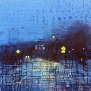
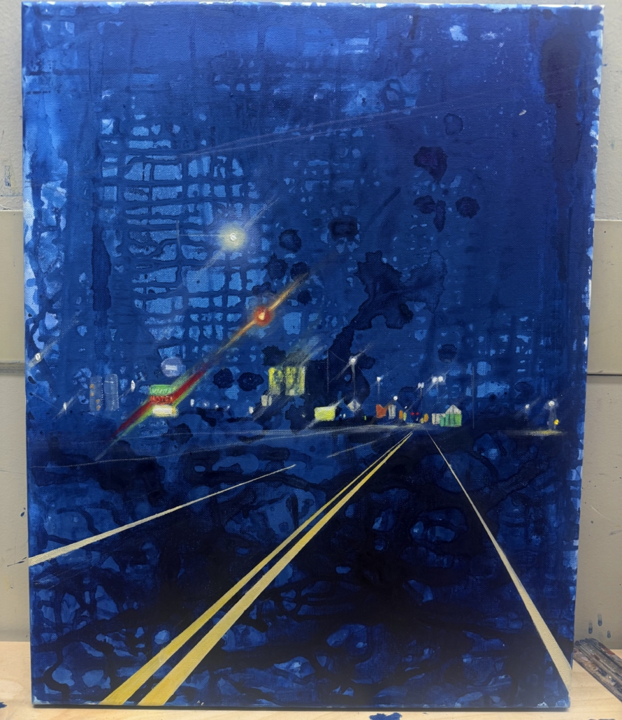
This series of paintings was inspired by the feeling of driving home after a long day. Coming home from the day’s activities, tired, warm, letting the scenery pass you by as if in a dream. Conceptually, the road represents our journey in life. The hero must face the path ahead and rise to meet any challenge in his path, yet after all the experiences that he gains from his journey, he has not truly won the battle until he returns home.
In the Studio:
This series used some techniques that I had not previously been employing on my canvas art, but was familiar from my work with watercolor. I have several spray bottles of water that I use in varying ways. I have a tiny bottle, which can put out a fine mist, leaving the paint mostly undisturbed. I have a large spray bottle for larger amounts of water output, or for creating a droplet effect, and I have a bottle with added wetting agent. Additionally I use squeeze bottles, droppers, and more to apply diluted paint to the canvas. I work in many, many layers. I add paint, sometimes selectively and sometimes allowing it to simply do what it will. This allows me to achieve a great deal of interesting texture and a sense of flow. The pigments in the mixed paint colors do not always behave the same way, occasionally creating striations and swirls of color as they dry.
Once I am satisfied with the background of the painting I spend time simply observing it. I look at the way the colors have created a burgeoning composition. Sometimes I do a sketch onto tracing paper, or sometimes I simply begin. I carefully observe the colors and details of the images I use for references, taking elements from several usually to create my final piece.
https://kiratstudio.com/wp-content/uploads/2025/07/IMG_0328-edited-scaled.jpeg2560251768793pwpadminhttps://kiratstudio.com/wp-content/uploads/2025/07/kt-logo-lg-263x300.png68793pwpadmin2025-07-21 16:35:382025-08-01 16:51:15Night Drive Series
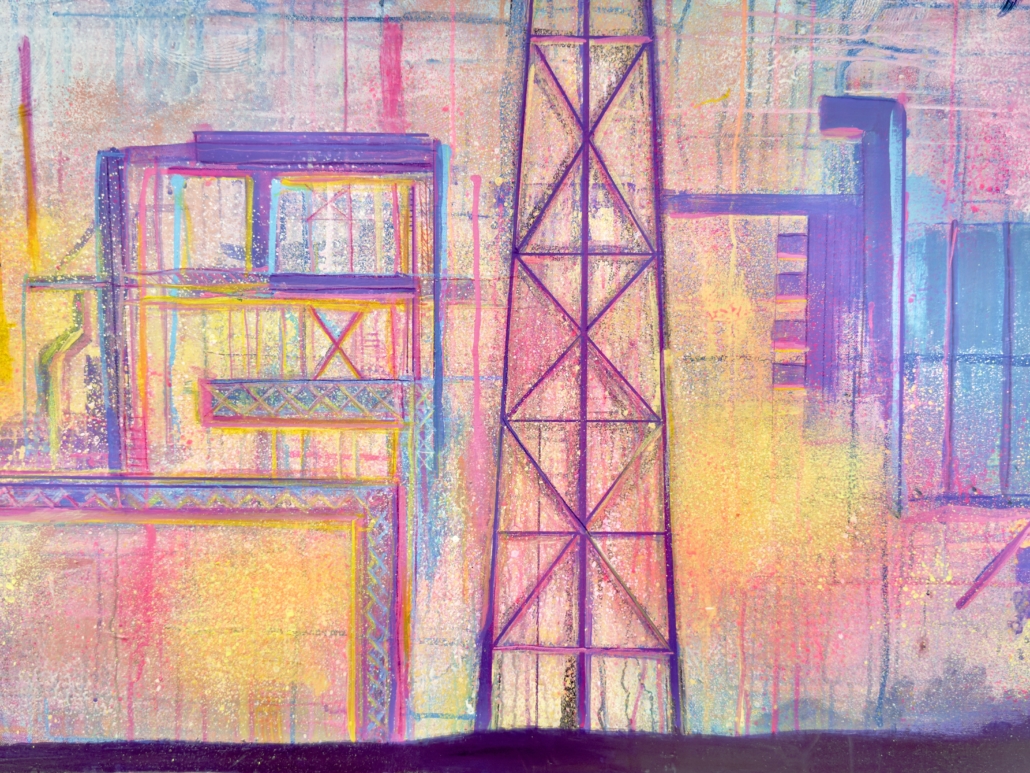
Art and creativity are a practice, a habit. We can choose to keep innovating or we can stagnate. Sometimes to improve your craft, you need to learn how to let go of perfection and control. This series has been an exploration into a more organic and expressive vision.
Lately I have been returning to more watercolor techniques. When I was learning how to paint, I worked primarily in watercolor. I loved the gentle washes and the way pigments would granulate and pool. Acrylic doesn’t behave exactly the same way, it is much more robust and less prone to flights of fancy. It can require much more encouragement to make it behave the way I want it to. There are many times when I am surprised by the results of a layer once it dries. This is all in the magic of it. The practice of watching the paint drip and gently mix is meditative, but not passive. I am constantly adjusting and babying the layers of paint to make them work for me, moving the canvas, spraying more water, finding the perfect angle so the paint has the right amount of flow, there are many steps.
Life has taught me recently the importance of detachment. I can’t control everything, sometimes it feels like I can barely control anything in my life. All I can do is have faith, and let go.
https://kiratstudio.com/wp-content/uploads/2025/07/IMG_0328-edited-scaled.jpeg2560251768793pwpadminhttps://kiratstudio.com/wp-content/uploads/2025/07/kt-logo-lg-263x300.png68793pwpadmin2025-07-19 16:27:262025-07-19 16:28:27New Art
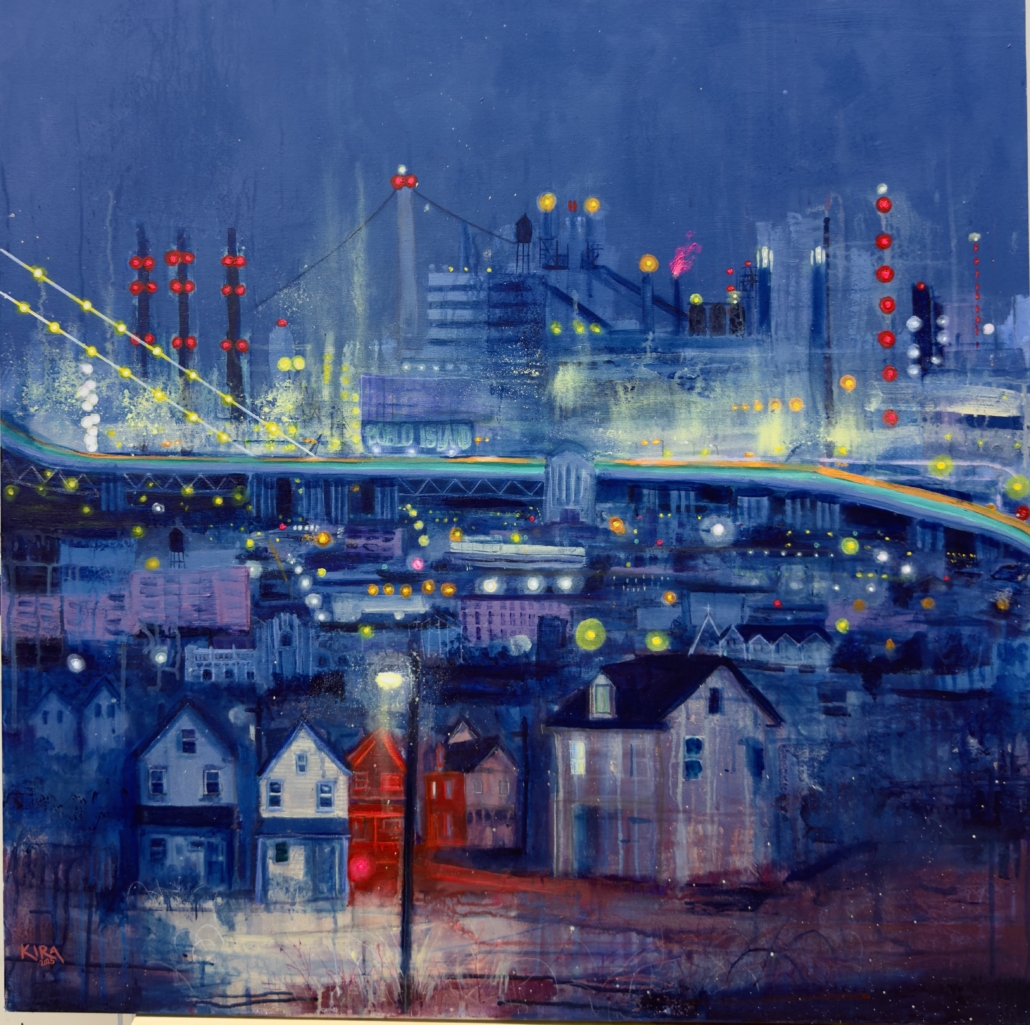
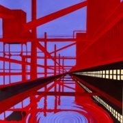
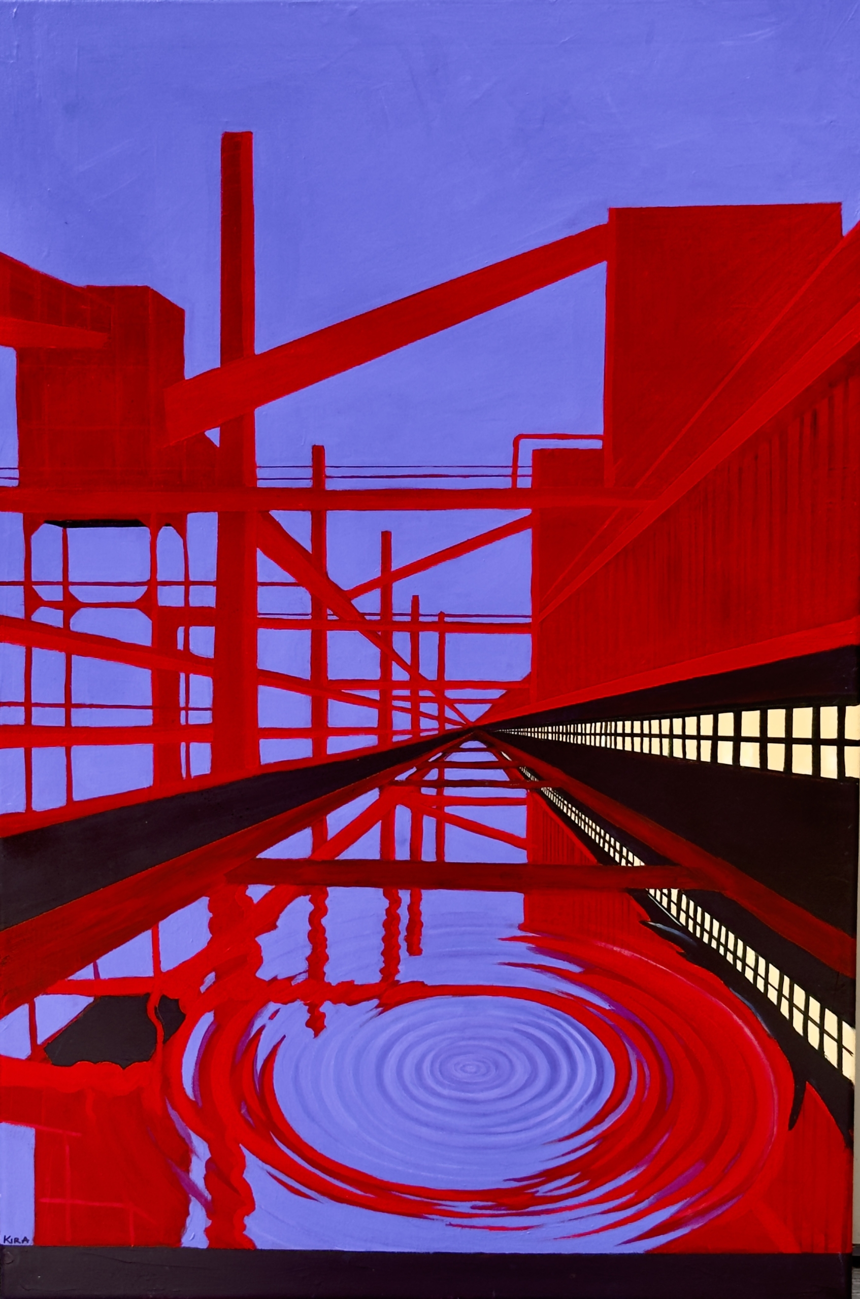
This painting is a tribute to the architecture of American industry—its sharp lines, towering structures, and the haunting beauty it leaves behind. I wanted to capture the feeling of standing in a place where machines once roared, now silent but still full of presence.
The bold red forms stretch across the canvas like scaffolding from a memory, intersecting and overlapping to create a sense of both structure and disorientation. The cool, reflective water below introduces a moment of quiet—disrupting the rigidity with a single ripple that radiates outward. That ripple became central to the piece: a symbol of impact, echo, and transformation.
Visually, the painting plays with perspective, symmetry, and light, leading the viewer down a corridor that feels both infinite and dreamlike. It’s rooted in Americana, evoking the spirit of industrial landscapes and the emotional weight they carry.
Echos is a meditation on presence and absence, order and memory. It reflects my ongoing interest in spaces that shape us, long after they’ve stopped functioning—and the beauty that lingers in their bones.
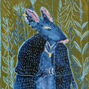
When I first became a mom, my world burst into color in a way I hadn’t expected. Amid diaper changes and sleepless nights, my creative voice shifted—softened, maybe, but also expanded. My babies didn’t just change my schedule; they changed my perspective. That’s how my series of colorful, kid-friendly canvases featuring anthropomorphized animals was born.
From Motherhood to Magic
I began this series when my children were very small—just beginning to discover the world through wide eyes and sticky fingers. As an artist, I’ve always been drawn to bold color, but motherhood invited me into a new palette: whimsy, innocence, and imagination.
These paintings became a way to blend my creative practice with my daily life as a mother. Between nap times and snack breaks, I found myself sketching cheerful foxes in overalls, giraffes with teacups, and bears riding bikes. They became characters in a world built to delight and spark wonder—not just for my own kids, but for anyone who needed a little dose of joy.
Why Anthropomorphized Animals?
There’s something timeless about animals who act like people. They show up in our favorite books and animated stories for a reason—they invite us into imagination with ease. A bunny wearing boots isn’t just cute; it’s a door to a dream world.
Children naturally connect with animals, and when those animals reflect human traits, they become tools for storytelling, emotional understanding, and play. Through these paintings, I wanted to create moments of connection—for kids to look at a canvas and say, “That squirrel looks like me!”
Color as an Invitation
Color plays a huge role in this series. I wanted each painting to feel like a celebration. Bright oranges, gentle blues, pops of pink and green—these aren’t just aesthetic choices, they’re invitations. They welcome children (and the child in all of us) to come closer, to ask questions, to imagine stories that go far beyond the edge of the frame.
Inspiring Imagination, One Brushstroke at a Time
At its core, this series is about sparking curiosity and joy. Whether it hangs in a nursery, a playroom, or a cozy corner of a living room, each piece is meant to stir something sweet and playful. I hope these whimsical creatures bring a little magic into your day, just as they brought magic into mine during those early years of motherhood.
https://kiratstudio.com/wp-content/uploads/2025/04/IMG_6993-scaled.jpeg2560205768793pwpadminhttps://kiratstudio.com/wp-content/uploads/2025/07/kt-logo-lg-263x300.png68793pwpadmin2025-04-22 20:10:502025-08-01 16:54:27The Animal Series
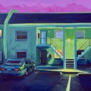
This series examines overlooked icons of Americana such as corner stores, gas stations, and motels, treating them as sites of cultural residue and quiet transformation. These spaces, often transient and peripheral, occupy a liminal position within the American landscape. They exist between points of departure and arrival, functioning as thresholds where movement pauses and time feels suspended.
I use vivid, saturated color to heighten the emotional charge embedded in these seemingly mundane locations. The brightness resists nostalgia and instead presents these structures as active elements within an evolving visual language. They appear not as static relics but as living symbols that reflect both continuity and change.
By isolating and recontextualizing these spaces, I explore the tension between familiarity and estrangement. Each painting becomes a reflection on memory, place, and the subtle architecture of everyday life. In celebrating what is often dismissed as ordinary, the work encourages a reconsideration of the American vernacular and reveals the aesthetic value embedded in its most unassuming forms.
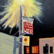
https://kiratstudio.com/wp-content/uploads/2025/03/IMG_5729-scaled.jpeg2560201368793pwpadminhttps://kiratstudio.com/wp-content/uploads/2025/07/kt-logo-lg-263x300.png68793pwpadmin2025-04-15 14:54:482025-08-01 16:48:05Liquor Store